Now, I’m not a professional designer but I am a designer. I can’t remember what I did last weekend, but I’ll never forget my black, red, and gold design for Ottawa AFC in FIFA 09. Anyways, my expertise has led to me to review the 2020 Canadian Premier League home kits which now includes Atlético Ottawa.
RELATED READING: 5 easy-to-miss flourishes from 2020 CPL home kits
New designs for HFX Wanderers FC, Forge FC, York9 FC, FC Edmonton, Valour FC, Cavalry FC, and Pacific FC were released back in February. Away kits for the 2020 season, meanwhile, are set to be unveiled at a later date. Thursday’s unveiling by Atlético Ottawa bucked a trend seen with the inaugural seven CPL clubs, who all appeared with white shorts and white socks – hinting at a uniform look for kits in 2020. With below-the-belt designs settled, let’s review these shirts, shall we?
RELATED READING: Atlético Ottawa unveils inaugural 2020 home kit
ATLÉTICO OTTAWA
What did you expect? Atlético Ottawa has pulled from Atlético Madrid’s well-known design for a classy, but not unexpected, inaugural strip. Its blue stripes and collar are attributed to the Rideau Canal, while a Canadian Maple Leaf on the back completes this capital look. It works quite well, with a predominantly white front-half of the jersey offering something new to Canadian kits.
FORGE FC

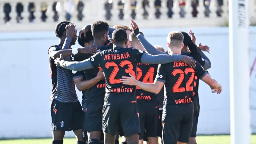
Hamilton’s CPL side has the most unique colour combination in North American soccer. It’s a blessing and a curse, as incorporating grey and orange together will always be a challenge. This combination is what doesn’t do it for me on this 2020 home kit. Grey shoulders is an admirable look and one that doesn’t look bad on its own.
PACIFIC FC
Pacific’s 2020 design sticks to Starfish Purple in a slight twist on 2019’s incredible design, which was one of my favorites. Outlines of a starfish run down the front, intertwining with white. I’m not entirely sold on this look – although the white shorts in combination comes out okay. Ultimately, the bottom of this is a bit busy for my liking and doesn’t offer enough to the overall design.
YORK9 FC

The Nine Stripes make a logical pivot by, uhh, adjusting their nine stripes from a lower-upward swoop to a Paris Saint Germain-style middle vertical stripe. It’s a classy adjustment – and it’s easy to admire Y9’s persistence on staying in white for a home option. Maybe it was the width of the green stripes or the massive charcoal grey block that mad the Year 1 kit that special, which will live in infamy.
HFX WANDERERS FC
Yeah, the Halifax Wanderers put freakin’ Stan Rogers on their 2020 home kit, as sound waves from “Barrett’s Privateers” are featured heavily near the waist. Who’s next: great Canadian fiddler Don Messer? How about Alanis Morrisette? That’s a free third-kit idea, Atlético Ottawa (oh my, imagine wearing a Jagged Little Pill-inspired soccer shirt?). In all seriousness, including “Barrett’s Privateers” – one of the all-time greatest pieces of music to come from Canada’s East Coast – is an incredible touch by the club, one that nods to its supporters, the city of Halifax, and Atlantic Canada as a whole. To be honest, the sound waves lift this kit to an incredible height. This blue-to-white gradient is unexpected-but-class from the Wanderers.
CAVALRY FC

As a millennial raised in the “minimalist aesthetic” world of post-Apple and other less-is-more brands, I find myself unfairly moving towards “clean” and “traditional” designs over what’s clearly cool nowadays, which is hyper-stylized everything. Cavalry FC’s 2020 kit is described as a “reimagined” version of their white slash design from last season. On first sight, I didn’t like it at all; too much white and too much going on. But now I see the vision from Cavalry. With a modern spin, this kit will look fantastic with white shorts and socks. It’s going to have a sharp feel on the pitch, for sure, and keeping with tradition – even if it’s just one year’s worth – is always a plus for me.
VALOUR FC
Not one but two collars for Valour FC this season. Comparisons to Arsenal’s centennial kit be damned, this design defies the inventive two-collar jokes and works incredibly well. Switching from the black accents of their inaugural season to white and gold makes for a modern and fresh look. The club has also made a clear commitment to sleeves. Few professional sides this side of the Atlantic Ocean have a distinct sleeve pattern. It’s a chance for Valour and Winnipeg to stand out for years to come.
FC EDMONTON
Doesn’t this year’s FC Edmonton kit pop? Year-over-year, it’s a clear swap of the two blues in FCE’s colour palette – from 2019’s darker tone to a deep-yet-light royal blue – and it works so incredibly well. The “X,” which signifies the club’s ten-year anniversary, is subtle enough behind the crest and just the right amount of detail for a kit like this. Oh, and the collar. Did you see how deep it goes? It’s like I’m watching a music video on MuchMusic in 2009… in a good way! (I didn’t want to end this on a Jason Derulo music video, so I’ll keep going.) The Eddies have hit on everything perfectly; a classic style, the right colour choice, and avoids an overwrought feeling many anniversary kits have.
