
This Thursday, all of the Canadian Premier League teams will unveil their Macron kits. It’s a given that no other sport is quite like soccer when it comes to the relationships players and fans have with their kits. When a team changes a the colours of a road kit, or adds a collar, the internet goes bonkers. Soccer is the gateway drug to fashion. That’s for sure. In anticipation of these unveilings, here’s a look back at eight kits that stand out for me; some of these designs are hailed as all time classics, while others may have been ahead of their time.
Canada, You Gotta Be-Leaf
Maybe the most striking kit Canada has worn (to date) was one of the three kits the team used in the qualifying cycle for France ‘98. While Canada didn’t qualify out of CONCACAF, it might have just had the best jerseys in the region. There was a black kit and a red kit with stripes that formed the shape of a maple leaf. But, the best of the lot was the white jersey, which featured a solid red maple leaf on an angle on the front. The white material of the jersey featured prints of all of the provincial and territorial shields, which gave the kit a true united-from-coast-to-coast kind of feel. It was anything but plain, to be sure, but the 1990s saw kits designers reach their heights when it came to making busy jerseys. And this one really stood out.
Denmark’s Candy-Cane Classic
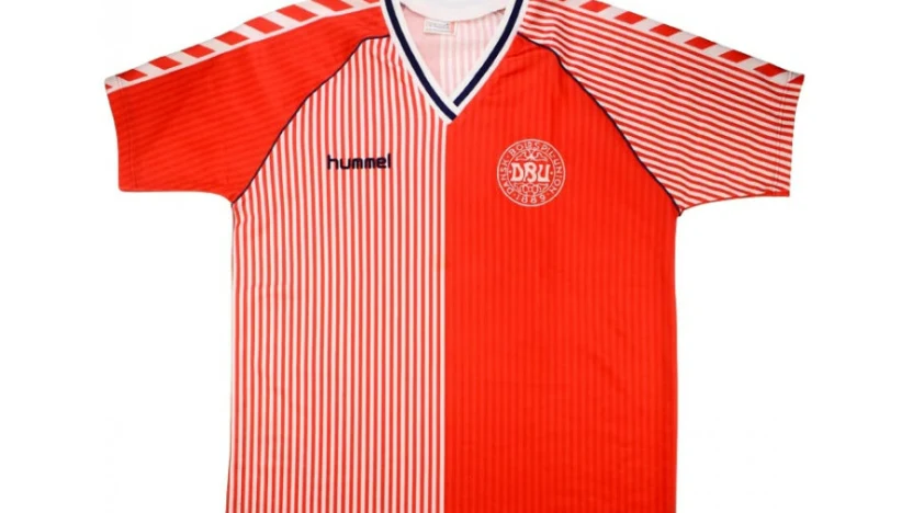
When it comes to ambition, Denmark’s Hummel kit for the ‘86 World Cup is an all-time classic. It made you think of Christmas because of the candy-cane stripes that adorned one half of the shirt. The other half was solid red. One sleeve had stripes, the other was one straight colour. It was oh so busy — but it worked. It was one of the most beautiful jerseys the soccer world has ever seen. From far away, the tight red-and-white striped bits melded together to form a pinkish hue. But, as you got closer, you could make out the tight lines that created the optical illusion. The numbers, to give bold contrast, were in dark blue. And that made it easy for commentators to tell who was playing, because it isn’t always easy to place numbers and make them readable on a patterned shirt.
Minnesota United’s Loon Wing
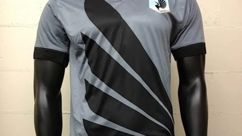
When Minnesota United moved from NASL to MLS, the club enjoyed bigger crowds and higher profile matches than they had in the second division. But there was one thing we all miss from the NASL days; and that’s the team’s fabulous Admiral grey jersey worn right before the team switched leagues.
What made it so great was that it was adorned with a large black loon’s wing. It was like the team’s entire home shirt was a crest. And it was oh so unique in North American soccer. It’s hard to make grey and black seem vibrant, but this kit did it. It’s one of the most original we’ve ever seen in North American soccer.
Nigeria’s Test Patterns
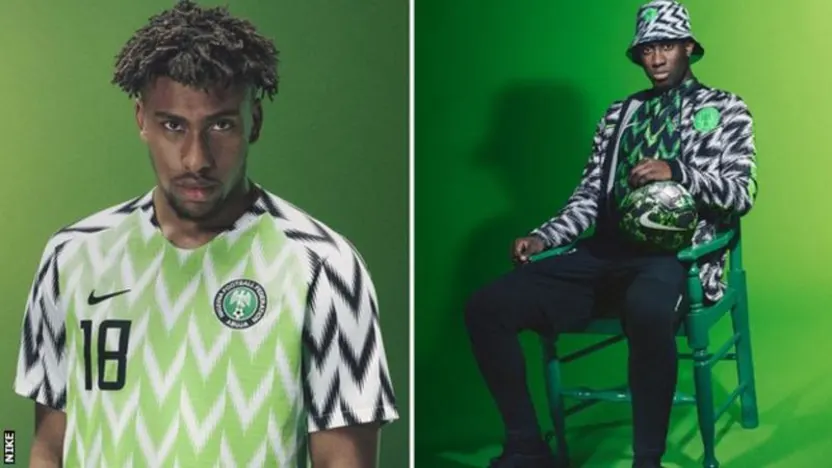
In Russia, the Nigerian national team was a hit when it came to soccer fashion. Too bad the team’s play didn’t mirror how good the players looked in the striking green, white and black kits. Nigeria has used both dark and neon green shades for home kits in the past, but the Nike kit was the most intricate at the tournament. The body of the shirt was patterned in bright green and white zig zags, that kind of looked like what you used to see when you tried to watch scrambled pay-TV signals. The sleeves were black and white, with that same frenetic pattern. The jersey was absolutely hypnotic in the way Nigeria’s on-field play wasn’t. Nike sure was a winner, though, as millions of replica kits were sold.
Montreal En Rose
The Montreal Impact, whether in NASL or MLS, have worn some combinations of blue, black and (sometimes) white. Well, mostly.
Remember that in 2010, Montreal debuted a special pink kit for the Canadian Championship. Most of the jersey was a dusty rose shade, save for black stripes that went up the sides. The shorts were black, but the socks also carried the pink theme. It was easily the most unusual kit we’ve seen from a Canadian team; we haven’t seen so many scruffy dudes wearing that shade of pink since Miami Vice was a hit show.
Cameroon, who needs sleeves?
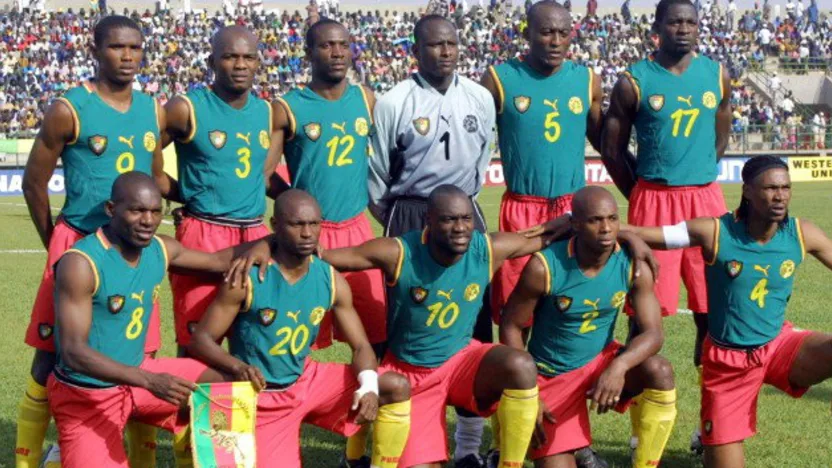
In 2002, Cameroon was prepped to wow the World Cup with a sleeveless jersey. Basically, it was the closest thing to a basketball look that we’ve ever seen on the pitch. Hey, it made sense; a jersey without material on the arms would offer an opposing defender that much less of a shirt to pull. The Indomitable Lions’ look has always been classic, a green home shirt with flashes of red and yellow. But the 2002 shirt was a bridge too far for FIFA. Before the start of the World Cup, FIFA announced it would not permit sleeveless jerseys. The question — had Cameroon been allowed to wear the sleeveless shirt, would it have changed soccer-jersey design? Would other clubs and national associations picked up on the basketball-style shirt? But, we can all agree that a sleeveless jersey would be a terrible idea for CPL autumn game in a place like Winnipeg or Edmonton, correct?
FC Edmonton, Boldly Going …

When Tom and Dave Fath decided to launch a new pro team in Edmonton, they hoped to boldly take pro soccer in Alberta where no one has gone before. And, in its first NASL season, the Eddies unveiled a jersey that was more spaced out than the Los Angeles Galaxy or the New York Cosmos. With blue shirts the colour of Romulan ale, the Eddies went with Star Trek font for the names and numbers. And it was totally awesome. I mean, who doesn’t want to see his or her name written in Star Trek font? In that first NASL season, the Eddies reached the playoffs. Then, the team went away from the Star Trek font and didn’t reach the post-season again till 2016.
Croatia, Every Time
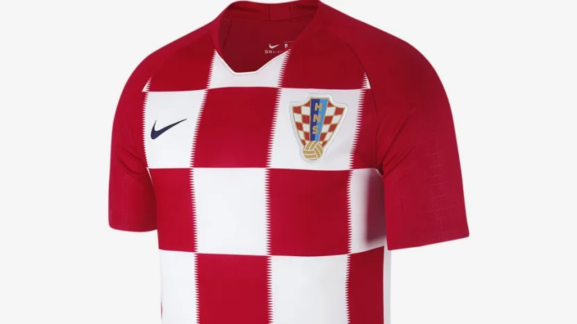
Checkerboard. Need we say more? Iconic. Beautiful. Croatia has only been recognized as a FIFA member since the mid 1990s, but the checks have, arguably, already become as iconic as Brazil’s canary yellow or Argentina’s albiceleste. From Davor Suker to Luka Modric, Croatia is consistently one of the world’s best-dressed teams.