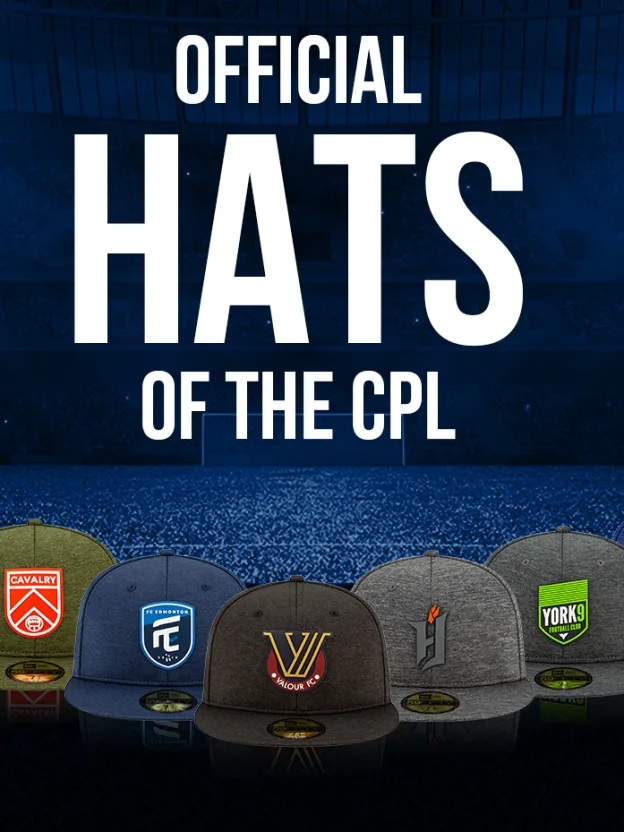
The Canadian Premier League today revealed the full line of the New Era cap collection. Fans can now purchase their favourite pieces from the seven-club collection which features a wealth of designs, styles and colours. View the full range here. CPL Editorial went behind the scenes to find out just how the collection came to life. “Once we officially sign a ‘licensee’ such as New Era we embark on a product development journey led by our marketing and licensing team to take them through our brand architecture,” Canadian Premier League’s head of products, Jim Neish told CanPL.ca. “It’s important that each licensee understand the context behind our brands and how we envision the look translating onto product. “Next, New Era takes the lead at developing a broad base of initial designs that we then begin to review until we’re aligned with the overall direction of the collection.” Once the process has begun, designers like Malcolm Halley at New Era begin to develop a broad base of initial designs, which are sent in for an initial review. “Generally, we will start with market research and assess trends on fabric, trims and application techniques. After we get an idea of the direction for the line, we begin concepts,” Halley told CanPL.ca. “Once initial concepts are finalized and specs are built, we then move onto prototypes – this is the moment of truth, when we see our concepts come to life for the first time. From this point there are usually a few rounds of prototypes before we land on the final product.” Prototypes are sent in for review, and, like Christmas morning, you can be sure they’ll be shown off within the office, with minor edits and tweaks made until a final product is approved. Because the Canadian Premier League’s seven founding clubs feature distinct colours along a wide spectrum, designing New Era caps for the CPL opens the door for plenty of creativity on both sides. “Our philosophy in year one was to play to the strength of each clubs’ unique colour pallet,” Neish explained. “The League’s Marketing team did such an amazing job at building a strong brand base that includes unique colour platforms for each club. From Pacific’s purple to York9’s fluorescent green, it gave New Era a head start and guided them through what could have been a tough year one design and development process.” Added Halley: “When designing an official collection for a league such as CPL, we tend to streamline the overall story with materials and developments that are used across the full collection – this keeps the story tight and allows the clubs marks and colours tell their individual stories.” When all this work is wrapped up, the products are ready for fans to sport as they please – and hit the shelves of each CPL stadium come match day, too. Fans can purchase their favourite pieces at the CanPL Shop.
Bedakian’s design rundown
Each New Era cap in the CPL collection brings a unique element of each club to the design. Here’s what stands out for this particular writer:
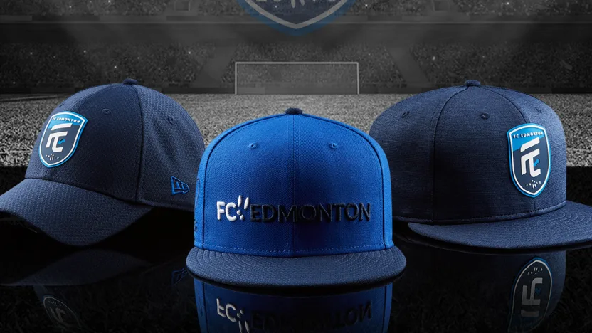
FC Edmonton’s navy blue baseball cap (left) is my personal favourite out of this bunch; though, the Rabbit ears are a lovely touch on the flat-brim (centre), as are the bold blue colours.
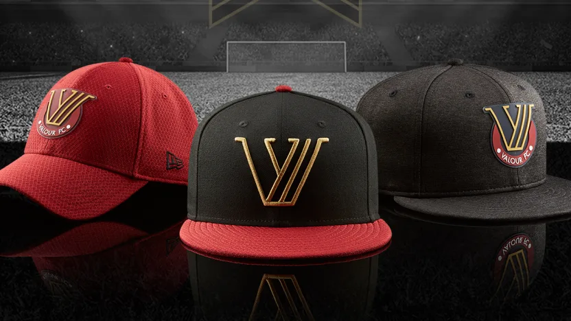
Simple, clean, but effective, the Valour FC caps will surely be a staple at Investors Group Field, but the stylized “V” coupled with the black-and-red combination of the centre cap, above, is the clear standout here.
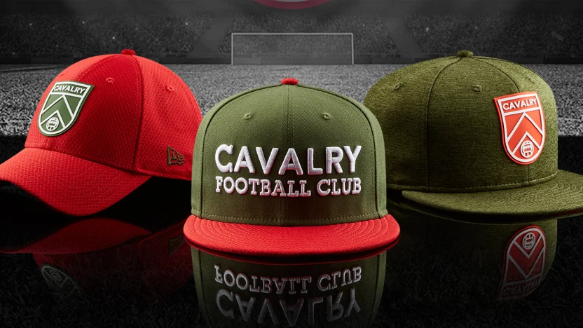
It’s the red-green show here for Cavalry FC, and the hat on the very far right does the best job of balancing the two colours in an aesthetically pleasing fashion, while boldly showing off the logo of the Spring winner. I’d rock it (in Spring … and maybe in Fall?)
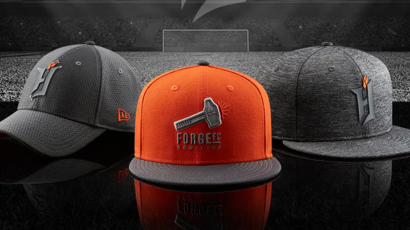
I genuinely can’t pick a favourite out of this trio, but as far as a daily wearer, no cap stands above Forge’s grey-on-grey baseball cap (left). However, you can be sure the Barton St. Battalion will embrace the orange cap (centre), too.
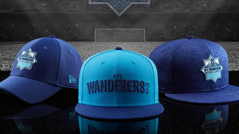
I can’t pick a favourite here; all three are amazing, and can be paired with so many combinations to complete an outfit. For my money, the flat-brim on the right would go particularly well with my favourite pair of jeans, though.
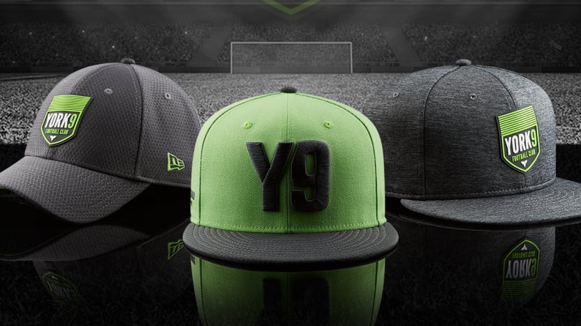
Y9 head coach Jimmy Brennan often rocks the baseball cap on the left, and who can blame him? It’s a pretty awesome look, grey and green. But the bold “Y9” of the centre design takes it for me; you know exactly what you’re getting with this look.
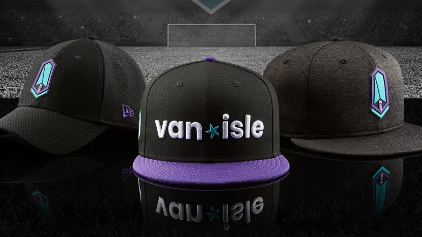
Classic combinations of colours and an emphasis on using Pacific’s teal and purple as compliments and not as main focuses makes this particular offering the cap of choice for a classic black hoodie outfit … which, to be honest, is my favourite look.
