The Canadian Premier League’s biggest day yet has come and gone, with the inaugural kits of the seven founding clubs now revealed and out for the court of public opinion. While the colourful and bold Macron kits are sure to turn a few heads, taste and fashion is entirely subjective, isn’t it? To that end, the Centre Circle LIVE! crew (that’s Kurt Larson, Armen Bedakian, and Marty Thompson) have their own favourite shirts. Which ones are the most inspired? Which shirts will we ourselves don at family functions or impromptu city walks with paparazzi flash all around us? Here are the three kits that hold a special place in each of our hearts:
Kurt Larson, Managing Editor

York9 FC (Away)
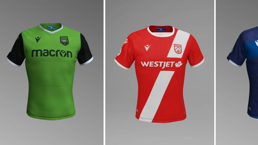
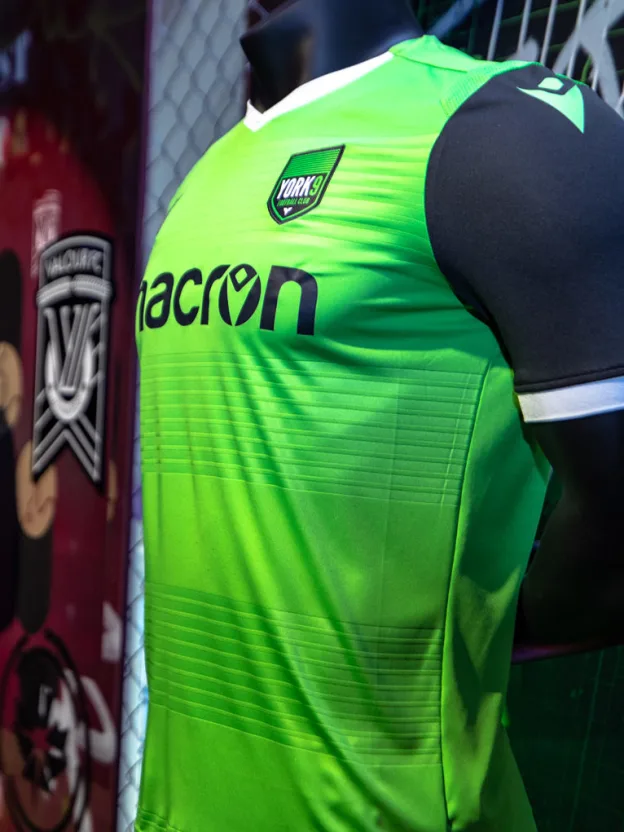
Nothing against Pacific FC’s “Starfish Purple” and “Lagoon Blue.” Both colours suit the island perfectly – however, Y9’s green strip offers the most appealing colourization in the league. Now then, my skillset doesn’t lend itself to fashion reviews, but that’s not stopping me from saying the “Nine Stripes” led the pack during Thursday night’s anticipated kit launch. The nine lines (hoops) on the kit are a nod to the municipalities that make York Region. I also like the subtle touch of having “Y9” on each player’s calf.
Cavalry FC (Home)
Cavalry’s home kit really ties it back to the community. Perhaps not as intricate as some of Macron’s other CPL designs, the white, diagonal sash is something of a classic among a group of kits that are quite loud. The horseshoe-inspired “C” on the lower back is a subtle detail that shouldn’t go unmentioned. Cavalry’s away camouflage kit will probably grab the most attention, but I think this classic look is one that will become synonymous with Cavs FC.
FC Edmonton (Home)
What’s better than a “Rally Rabbit” hopping across the lower back of a uniform? Beyond that, FC Edmonton’s all blues are, quite simply, simple and sharp. The ability to weave the North Saskatchewan River into the chest is a nice touch that ties the club back to the league’s northern most city.
Armen Bedakian, Associate Editor

HFX Wanderers FC (Home)
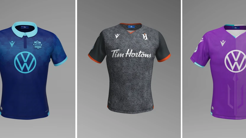
A masterclass in colour balance and design, the Wanderers’ dark blue home kit hits all the right notes for this unabashed Chelsea supporter. It’s the little touches that make this shirt so great – the citadel pattern, repeated along the chest; the symmetrical colouring of the Macron Hero, the Volkswagen logo, and the club’s badge; the collar. It’s just outstanding, and my personal favourite out of the entire bunch.
Forge FC (Away)
Brushed metal with sparks of orange? Oh yes. Foregoing the colour-pop of its peers, Forge FC pays homage to the industrious people and history of Hamilton with this metal-inspired design, and as far as grey kits go, this one’s as good as any. The little touches go a long way for many of these kits, but on the field? With grass stains and rips and tears and scuffs and marks? Forge FC’s away kits look steely enough (sorry…) to survive the tribulations of away travel.
Pacific FC (home)
You know, seeing this purple shirt in-person, I was struck by the thought – why don’t more teams use this colour? It’s not as widely seen as your reds or blues or whites, but, as Pacific FC demonstrates here, it can be even more visually pleasing than anything else on the colour spectrum. The two-tone plays into this idea even more, but it’s the trident on the front that really drives it home for me. Poseidon himself would be proud of this one.
Marty Thompson, Digital Content Editor

FC Edmonton (Away)
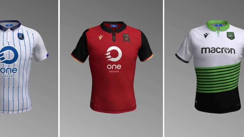
I’m a sucker for white-and-blue… and for timeless full-body designs. This kit has both. The navy-stripes-on-white looks very sharp head-on. It’s a design Eddies fans can hopefully get behind, especially as head coach Jeff Paulus’ side will wear a white shirt as the secondary kit for the first time in club history. Both Edmonton kits also feature, to me, the best sublimated image featured on these Macron designs — a lunging rabbit. A classy reference to the only CPL club with a lengthy history.
Valour FC (Home)
Based on the Victoria Cross and, by extension, the club’s crest, Valour FC’s inaugural home kit is about as classy as it gets. It starts with the collar, black with gold accents, and ends with that incredible maroon colour that comes down to the hem. This kit has the best chance, with it’s black sleeves and white shorts, to become a “signature look” for the club looking forward (think Barcelona in blue and maroon stripes, Arsenal with white sleeves). I’d love to see Valour suit up like this well past 2019.
York9 FC (Home)
If I asked you to design a kit with nine light green stripes, how do you think it would look? Pretty bad, right? That’s what makes this York9 kit so impressive; nine green stripes to honour the namesake, grey to balance it out. It’s ingenious. I love how high the stripe element goes up the body, too. It’s just so unique. Playing off of the stripes, the club can go with grey shorts on this kit, effectively adding another dark combination to its roster of looks in Year 1.
