
Welcome to the York United Football Club era, Southern Ontario. The Canadian Premier League unveiled a new identity Friday afternoon, swapping the “York9 FC” moniker for an identity with a “new community” in mind, looking to unite fans across the Greater Toronto Area.
York United Rebrand: 4 things you may have missed || York United Football Club unveils new identity || 9 moments from York9 era
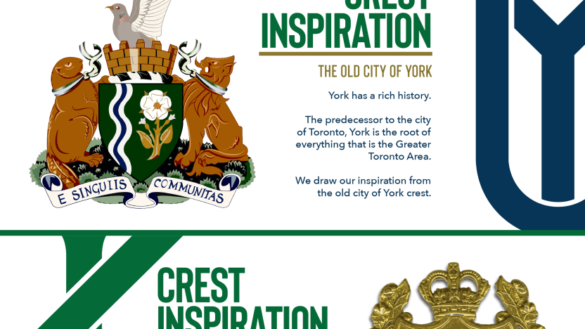
York United’s crest is inspired by elements from Toronto, which was formerly known as the “City of York,” while the additions of blue and gold mark a major change in the club’s colour scheme from the neon green and charcoal of its first two seasons. CanPL.ca sat down with York managing consultant Angus McNab to explain the rebrand, why they chose blue, green, and gold, and why they chose the name “York United.”
CanPL.ca: Walk us through the process – how it started and how you got to York United?

Angus McNab: It’s almost a year to the day since I walked into the club offices. When I got there, it was felt that the brand, and the overall messaging of the club was quite a limiting factor in our growth. You need to make sure that you have it right. So exploring what the old brand gave us in terms of versatility, merchandise, in creative, and even some of the process in previous years with Macron. I think we did a reasonable job in 2020 with the away jersey but we still didn’t, for me, nail that and there was room for improvement. The pandemic gave us a little bit of time to reevaluate, because we weren’t in the day-to-day, match mode so it became time to put a survey into market with our season seat members, looked at other third-party research, and the conversation really just spiraled to some of the alternatives.
This was an internal design thing with myself, Rob, Nate, who worked on those elements. I brought in a good friend of mine, Carl Hudson, who’s the creative director at the New York Islanders. His job was to evaluate and stress test some of the branding done initially and that was really the first evolution of what took us to this point in color exploration and what we wanted with this new identity.
What is the goal with this rebrand from the club’s perspective?
We felt we were always fighting for relevance within the GTA and the York Region sports market and we needed to stand out. The rebrand, the visual aspect, is a reset button. Ultimately, it gave us a clear line to move on from and build something new. The goal now is very, very simple: we have to live up to the potential of this football club, which is absolutely massive. We need to be capturing the hearts and minds of people in the GTA and live our mission, vision, and values to build community and build this club. We want to be a powerhouse within the CPL. We’re going to be innovative, creative, and adapt to the situation and circumstances that have been presented to us and grow and build a brand that represents and unites the entire community.
Is this a direct invite for fans in Toronto? Is that the message with something like “Lake Ontario Blue” added as a club colour?
Lake Ontario is linked together by rivers and waterways. York Region as it is, and the old historic city of York, Toronto, sits on top of Lake Ontario as we have noted with our alternate mark. Other elements of inspiration are the shield shape, from the Queen’s York Rangers – an army regiment that serves both the region and the city with Fort York and the Aurora Armory.
What about the name “United”?
“United” is a traditional football club naming convention, yes, but we are about uniting and welcoming people and being an open and inclusive community, a welcoming club, and a place for all who want to celebrate soccer within the GTA. It’s less about geographic borders. If you are passionate, and you share the mission we have, we want you.
Who designed the mark itself?
Robert Marchese designed it. He’s worked in our office since day one. Ultimately, this has come from someone who’s lived the club and been one of the heartbeats of it, and has garnered a lot of praise from the fan base over the last 12 months for video content and our overall visual approach. He’s lived the brand and sees the potential of this club. His work is what represents us going forward. I’m very happy with what he’s used as design inspiration to get us to this point.
What is your favourite element of the rebrand?
The stripes within it are great. The fact that we’ve retained and made The Nine Stripes central is important. Yes, while we are welcoming more people in, we’re certainly not neglecting or forgetting what we’ve been. It’s important to retain some of these elements: the Trillium, The Nine Stripes, etc. What will work best are the many elements within it that give us great versatility and different ways to present and represent the club.
It’s our understanding this “Nine Stripes Edition” kit unveiled Friday is, for lack of a better word, a secondary uniform. What will the primary kit look like?
We will stay with a tradition of a white strip. It looks really sharp and uses other elements from this rebrand really well.
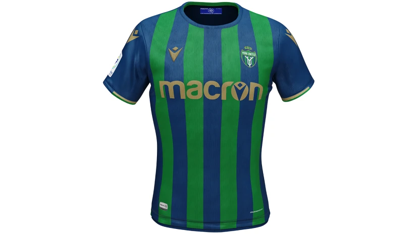
York United offers a more subtle green and added blue and gold elements. How did you come to that colour palette?
This is more a balanced look. The neon green we had before didn’t give much versatility in merchandising and range. This gives us many, many more options on the merchandise side things with navy, green, white, and gold. It has to stand on its own within the GTA; the neon green wasn’t necessarily practical as everyday wear for a lot of our fanbase, but we want things like polo shirts, t-shirts, and sweaters to be everywhere throughout the region and GTA. We have some quite traditional football communities within our area and they told us they wanted something that feels a bit more classic. That was the real aim there: How do you make a club that’s two years old, feel historic? The design and palate achieves that. We needed to make it accessible to people so we can have the whole family in it and feel comfortable within their own range of style. The pieces of casual wear from a New Era and whatnot…. People will be happy with it and see that there’s a bit more versatility.
What do you want Canadian soccer as a whole to know about this rebrand?
That we are genuine in our desire to build a community – and build something for those that want to be attached to it. We want to commit to working with our fan base and growing our fan base, building and uniting a community and that starts with everyone in the stands. We want to make them proud. I personally want to deliver a championship-winning team in a full stadium with fans cheering on York United.