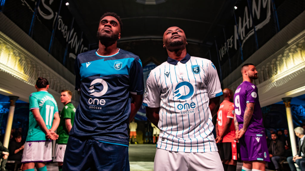
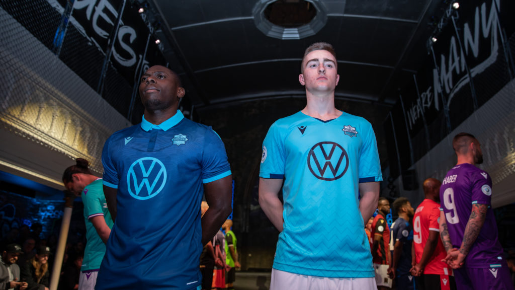
On April 4, the Canadian Premier League hosted a Canadian football fashion show to introduce the leagues’ home and away kits (along with other articles of clothing). The kits, which had not been previously viewed by the public, were well received by both the attending audience and Toronto’s fashion elite.
During the show, I got the opportunity to speak with some of Toronto’s top fashion designers, like Annie Hart, fashionista and designer, who purred, “It’s a brand manager’s dream, picking the palette and tuning the design to the local supporters.”
Even the best dressed man in Toronto sports loved the collection.
“I have my favourites,” admitted Gareth Wheeler, “but the HFX Wanderers (home) kit is beautiful. With the navy blue base and the light blue collar, it’s sharp, it’s on point. I love a kit with a collar.”
While I agree with all the above comments, I also couldn’t help but wonder what the actual fashion industry would think.
So, I assembled a panel of top Toronto designers, models, and photographers to give their unbiased opinion on the pieces.
Welcome to Project Runway: Canadian Premier League Edition
Cavalry FC

Home: Cavalry’s uniform –I giggled that I guessed right it was Calgary’s team: Cavalry, Calgary—is anything but a laughing matter. Crisp cherry red with a striking white stripe feels fresh and beckons a hint of Canadiana. The approach to keep their uniform slick and modern will surely revive energy even late in the second half. – Michael Zoffranieri, ZOFF
Away: I love the green and white it’s very striking and not over kill. I always rather when the sponsor doesn’t smother the entire jersey but this is just right. Material looks great too! – Tia Duffy, Model
FC Edmonton

Home: I love the One Soccer logo as it looks very sleek (and almost reminds me of a visual depiction of aerodynamics or a soccer ball in motion). It has great contrast against the dark blue colour of the jersey which makes it jump out and catch the eye immediately upon looking at it. I like the subtle detail on the sleeves as well. – Arthur Mola, Photographer
Away: Can’t go wrong with a striped jersey. Some of the most prestigious and successful clubs in the world have striped kits, (Juve, AC Milan, Argentina, Italian Away kits for 2014 World Cup), so it shows the confidence they have in their team! Love the collar I think it looks stylish, simple and traditional, while breaking some rules by keeping the lines irregular. – Camila Gonzalez, Model
Forge FC

Home: One of my fav colour combinations, orange and grey. Very modern. It’s warm, masculine and friendly. I particularly love the notched neckline and the sleeve detail, with the right and left alternating pipe detail. Love that the whole look starts with the orange jersey, and ends with orange socks with the grey sock topper that meets the shorts. Very clever a real standout on the field. – Karyn Ruiz, Lilliput Hats
Away: This team’s heather grey jersey may seem relaxed, but the intense orange shorts add energy and vibrancy. Balance is key in design, especially if it affects visual cues and team morale, as uniforms do in sport. – Michael Zoffranieri, ZOFF
HFX Wanderers FC

Home: A clean look, classic and sophisticated. The colour combination is solid and timeless. – David Dixon, David Dixon
Away: The zig zag likes on the blue jersey are so unusual! But it works and it’s very different. I love the navy touch on the arms. Classy! – Tia Duffy, Model
Pacific FC

Home: I really like the collar detail on this green and purple jersey. The colour combination is fresh and unexpected! The shorts I feel could are a bit basic, and could incorporate a design element that would be distinctive and thoughtful – David Dixon, David Dixon
Away: You‘ll never fail to spot your favourite player rocking this statement colour kit. This bold, fashion forward colour combo of purple and aqua with subtle sleeve and neckline detail makes this a total win on the field. – Karyn Ruiz, Lilliput Hats
Valour FC

Home: Winnipeg’s Valour FC, after a quick internet search for discussion purposes, has set out a uniform that is European in feeling. Gold, black, and burgundy create an almost German essence, and I appreciate the collar, and faux lacing detail at the front neckline. Finished with the grey short, this look could be great for the field and fans alike. And I’m not talking Oktober Fest! – Michael Zoffranieri, ZOFF
Away: The red one looks great there’s a lot of detail in that one the yellow black and red look cool together. Loving that collar and the yellow detail throughout. The black line down the side rounds it off nicely. – Tia Duffy, Model
York9 FC

Home: For the home jersey, I love the addition of the collar. To me it is an elegant feature that differentiates it from other jerseys and makes it stand out from the rest. I also like the color scheme of it. Crisp white with colourful accents always looks fantastic and will pop visually in any setting. – Arthur Mola, Photographer
Away: This is a super classic look with a retro acid green and black combo. The tank front with the contrast sleeve is eye-catching and graphic and the subtle horizontal detail is a sassy touch – Karyn Ruiz, Lilliput Hats
The Full Roster

“I think these kits are amazing! They’re really representative of the class of soccer that we are going to see. Every team’s kits are cohesive, they’re vibrant, and they’re powerful. The use of colour I think is really refreshing and shows a bit of the diversity we see in Canada too.” – Camila Gonzalez, Model
“Overall, the Canadian Premier League has opted for modern interpretations on sporting uniform. Fresh and unique choices, Canadian Premier League! Here’s to hoping for even more exciting matches, coming to a pitch near you!” – Michael Zoffranieri, ZOFF
Meet the panel
David Dixon, David Dixon
David Dixon stands out among that of his Canadian contemporaries as one of the leaders in women’s fashion design. Dixon apprenticed with well-known Canadian designer Alfred Sung and in 1995, established the David Dixon label. Today, David Dixon is sold across four continents, while his innovative designs have won him a following among the likes of Jann Arden, Pamela Anderson, Meg Ryan, Jennifer Love Hewitt, and Paul Gross.
Tia Duffy, Model
Tia Duffy is an international curvy model fashion activist and founder of the Be Body Aware project. She has worked for magazines like Vogue, Teen Vogue and writes regular blogs for the Huffington Post.
Camila Gonzalez, Model and former Miss Canada
Camila Gonzalez is a television host and producer for TLN Media Group. Camila has represented Canada internationally both as a reporter and in pageantry in Hong Kong, Nanjing, Bolivia, Colombia, Japan and the U.S. She currently holds the title of Miss International Canada 2018.
Arthur Mola, Photographer
Arthur Mola is a freelance photographer based out of Toronto. He covers some of the world’s premier entertainment events like the Cannes, Sundance, and Toronto Film Festivals for the Associated Press and shoots for a roster of his own clients. His work is regularly published all over the world in the likes of Vanity Fair, Vogue, People, Us Weekly, GQ, and Rolling Stone among others.
Karyn Ruiz, Lilliput Hats
Karyn Ruiz and her team of highly skilled associates at Lilliput Hats handcraft each hat to exacting specifications. Clients included Sophie Grégoire Trudeau (who sported a black pillbox at an official meeting with Pope Francis), Rachel McAdams, and Whoopi Goldberg. Additionally, Karyn created a series of hats for Gord Downie for the Tragically Hip’s final Canadian tour.
Michael Zoffranieri, ZOFF
Michael Zoffranieri is the creative mind behind ZOFF. Founded on the principle that art is movement, ZOFF is a luxury evening-wear’s label crafted through the lens of European-styles. ZOFF is the recipient of the 2017 Suzanne Rogers Award for Most Promising New Label and was nominated for the Swarovski Emerging Talent Award (Fashion Design) at the 2018 Canadian Arts and Fashion Awards.


