


York9 FC is no more. Welcome, York United Football Club.
Club chairman Mike Baldassara, president and general manager Angus McNab, and Canadian Premier League Commissioner David Clanachan were joined by soccer personality James Sharman in the announcement, which brought a new name, crest, and colours to the CPL’s York club.
York United Rebrand: Rebrand Q&A with Angus McNab || York United Football Club unveils new identity || 9 moments from York9 era
The new identity, which is the result of extensive research and consultation with supporters, is intended to help connect the club with soccer fans across York Region and Toronto, aiming to create something that people can get behind across the GTA.
From the four new colours (York Green, Lake Ontario Blue, Trillium White, and Victory Gold, for those wondering) to the design of the new crest, there’s a lot to dive into.
So, here’s a good place to start.
York United crest heavily inspired by modern-day Toronto
“York means different things to different people.”
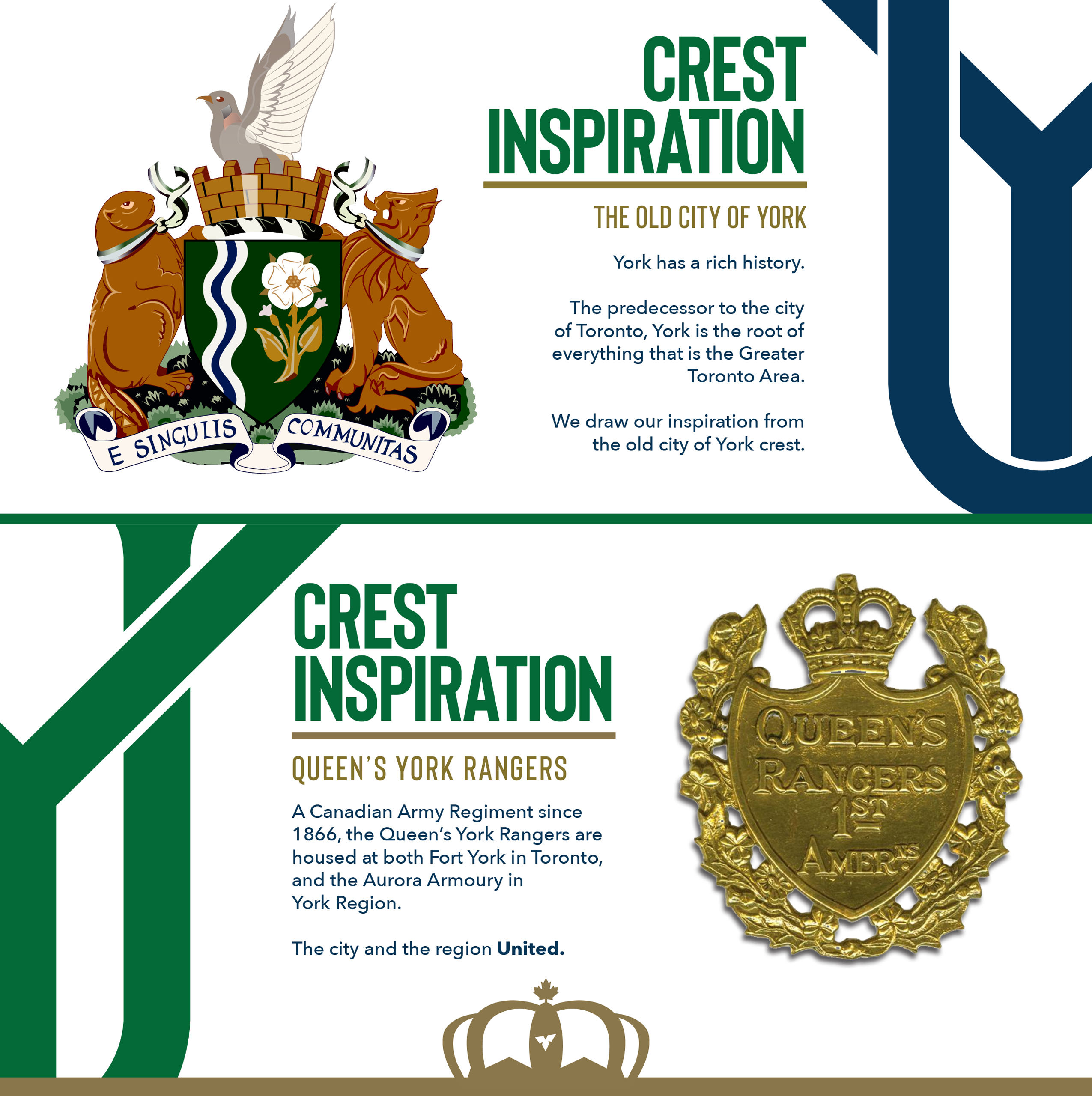
York United’s crest is inspired by two elements, which come from outside of York Region, and are meant to bridge the gap between Toronto proper and its old namesake.
First is the old “City of York” – now modern-day Toronto – coat of arms. The name “Toronto” was adapted in 1834, replacing its royal name while the “County of York” remained, stretching from the shores of Lake Ontario through modern-day York Region, reaching Lake Simcoe to the north.
Second is the Queen’s York Rangers, a Canadian army regiment housed in Fort York on the shores of Lake Ontario and Aurora to the north. These bases, occupied in the 1860s, stand at opposite ends of old York County, with the club adding the symbolism of “uniting the city and region.”
This is all without mentioning the club’s alternate mark, which shows Toronto’s skyline with three blue lines representing rivers that run from York Region to Lake Ontario: Rouge River, Humber River, and Don River.
“The Nine Stripes” nickname remains

York United managing consultant Angus McNab said that retaining the nickname from their days as York9 FC was “crucial” to the new look.
“While we are welcoming more people in, we’re certainly not neglecting or forgetting what we’ve been,” McNab told CanPL.ca. “It’s important to retain some of these elements: the Trillium on the crown, The Nine Stripes, etc.”
Nine vertical stripes appear on the crest, behind the “YU” lettermark, and on the club’s “Nine Stripes Edition” uniform unveiled Friday…
York will retain a white kit tradition

Don’t be fooled: The Nine Stripes will continue to wear white.
Managing consultant Angus McNab confirmed the Macron-produced strip unveiled Friday, the “Nine Stripes Edition” uniform, will not be the club’s go-to home kit, saying a primarily white uniform will be unveiled before the 2021 season.
York9 played in first-choice white strips in the first two seasons of the CPL and famously wore white for the CPL’s Inaugural Game. While McNab is hesitant to refer to one kit as “primary,” the tradition of York in white will continue.
Crest designed by “day one” employee
The York United brand was conceived in-house, with a crest designed by Robert Marchese, a member of the club’s media team.
“It’s his design,” McNab confirmed to CanPL.ca. “Rob has worked in our office since day one. He’s lived the brand and sees the potential of this club. His work is what represents us going forward.”