When it rains, it pours for Canadian soccer fans.
CPL clubs revealed their brand new 2021 “Community” kits Monday just days after the 2021 CPL season was announced with “The Kickoff,” a four-week single-site start to the season in Winnipeg at Valour FC’s IG Field with the aim to return to home markets later this Summer. The eight kits will see the field for the first time in Winnipeg as CPL clubs have the option to wear these 2021 kits and both were worn at the Island Games last Summer.
Which one will look the best when it hits the turf at IG Field? Well, CanPL.ca’s Marty Thompson, Charlie O’Connor-Clarke, and Benedict Rhodes – three self-proclaimed kit experts – have weighed in with their favourite.
Marty Thompson – Valour FC

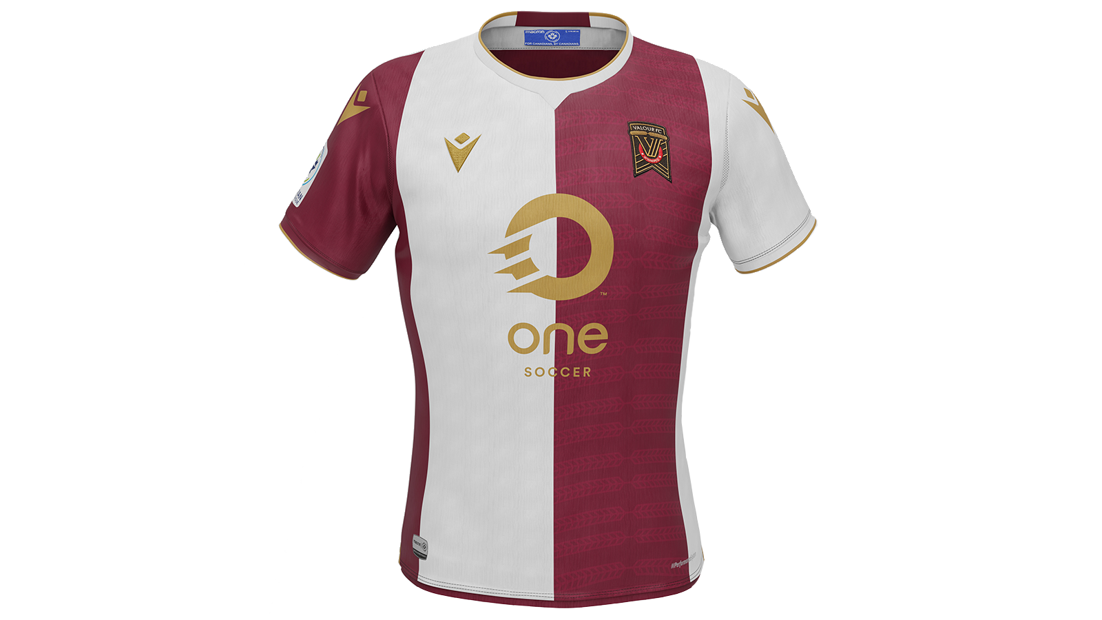
My love for Valour FC’s look has grown in 2021.
Primarily white, Winnipeg’s new strip introduces the first proper half-and-half design we’ve seen in the CPL’s history and plays off the club’s dedication to coloured sleeves (seen on both their 2019 and 2020 kits).
The sublimated wheat designs, lifted from the crest, adds a nice layered touch to the maroon side of the shirt. In a release, the club said this was inspired by Manitoba’s golden wheat fields. These white panels must be winter wheat, then?
This gold detailing further adds to the ambition of this kit which is, objectively, the boldest design of the eight Community kits released Monday. Valour has a knack for putting out ambitious kits that somehow still feel classy and modest – a perfect combination for kit designing, if you ask me.
Charlie O’Connor-Clarke – HFX Wanderers FC

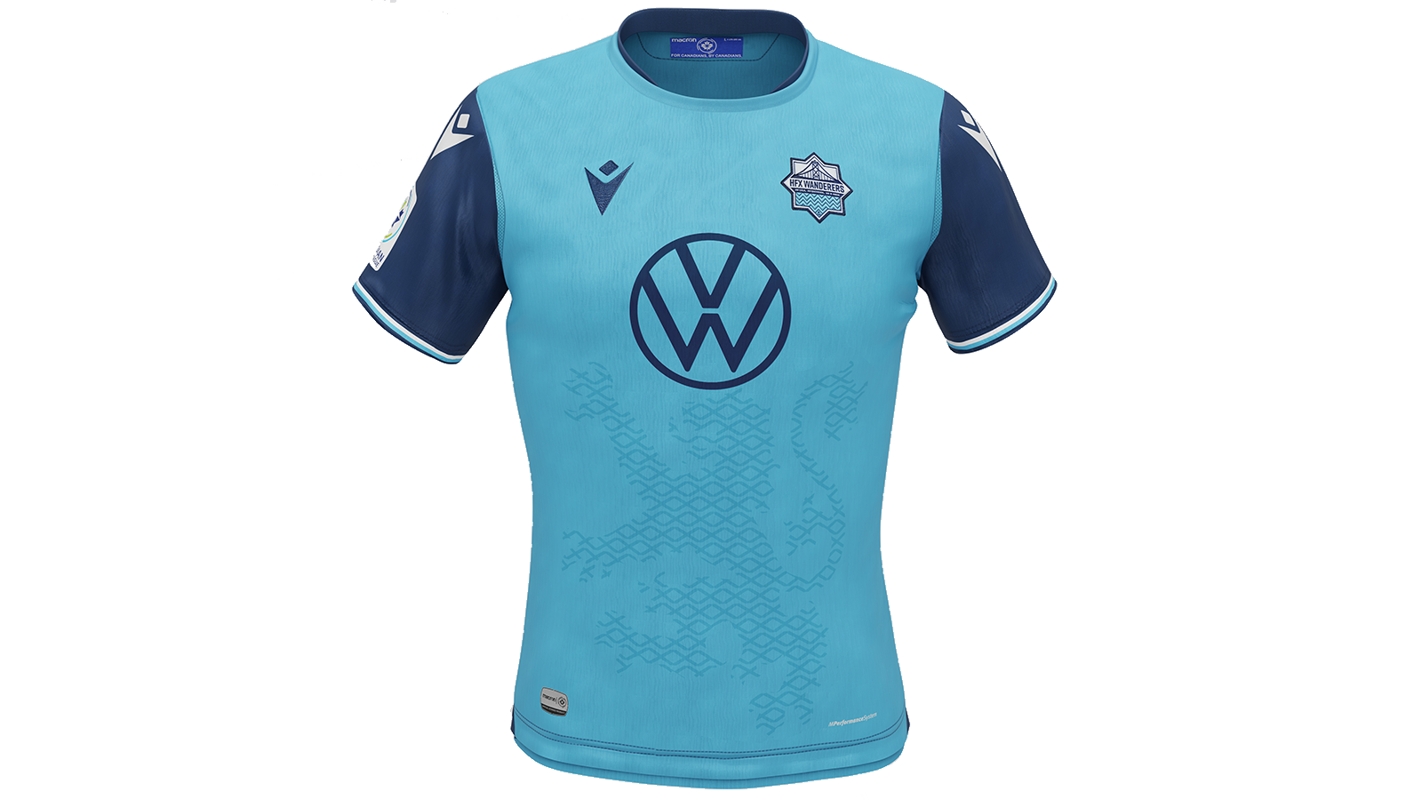
The striking double-blue really makes this for me. It’s a unique colour combination, and it’ll contribute to a strong identity for the Wanderers. The lines are sharp, and the details — subtly striped cuffs and some dark blue on the collar — really make it pop up close.
All of the new CPL strips incorporate some kind of symbol or design rooted in the club’s community and local heritage, but I think Halifax’s sublimated Lion Rampant is my favourite. They’ve leaned into the Nova Scotian aspect of the club and it works perfectly.
Look a little closer, and the very faint patterning across the torso add some nice texture to the shirt as well. This kit will be instantly recognizable from a mile away, and it’s even better up close. It’s an immediate classic, and Akeem Garcia will look better than ever dancing around defenders this year.
Benedict Rhodes – Cavalry FC

While I am slightly disappointed that they’re losing the white sash after two previous kits with it, Cavalry still knocked it out of the park with this.
The club is once again honouring the city’s military history, in particular Colonel James Macleod and the North-West Mounted Police. The front features a silhouette of Macleod on a horse, and the back has a silhouette of Fort Calgary, built by the North-West Mounted Police in the late 19th century.
Both graphics are well-done, and the meaning behind it is significant, but the design itself is quite nice as well. The green accents are also effective, adding another splash of colour to an otherwise great red kit.


