With the last of the 2022 Canadian Premier League kits, created by Macron, being revealed by Pacific FC on Sunday, the full slate of 17 new shirts has now officially been revealed. The primary kits were revealed together on March 17, all eight clubs getting a new shirt for the upcoming season. Then, each team released its alternate uniforms at community-driven events in the past few weeks throughout the lead-up to the beginning of the new campaign. New for this year is that each CPL kit will be made from Macron Eco Fabrics, using threads made of 100% PET recycled polyester, with each manufactured shirt made from 13 recycled 500 mL bottles. This manufacturing process has the effect of requiring less energy during the production chain for each shirt. Plus, the 2022 kits feature a newly-designed name and number set for official player shirts. Defending champions Pacific FC will wear the North Star Badge over their crest, and Forge FC are the first side to wear the Legacy Patch on their sleeve, which denotes how many previous championships they have won (in their case, two).
CPL jerseys are available for purchase at CanPL.ca/shop, as well as on individual club websites. Here are all the new Macron CPL kits for 2022. For more information on each individual jersey, click on its image.
 Pacific FC
Primary
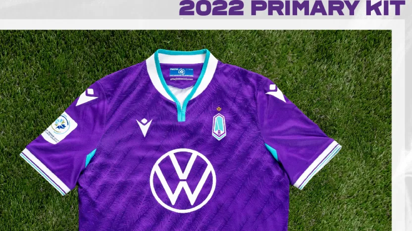
The Pacific FC primary kit features the club’s classic purple colour with accents of the lagoon blue that has featured on their kits in years past. The shirt is made unique by a sublimated Douglas fir pattern, representing the trees that cover much of Vancouver Island. As defending CPL champions, Pacific are the first club to wear the North Star Badge above their crest.
Alternate
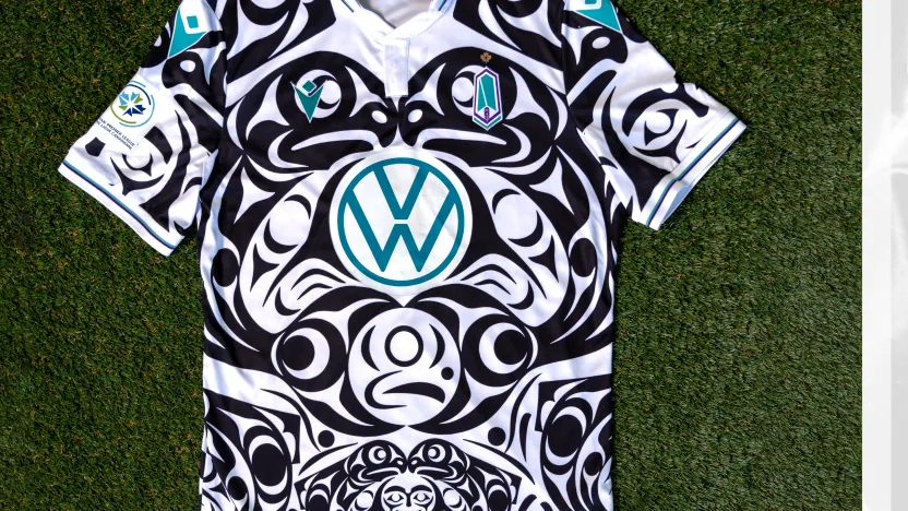
Pacific FC’s alternate Macron jersey is an incredibly meaningful design this season. The uniquely bold black and white print designed by Coast Salish artist Maynard Johnny Jr. (Thii Hayqwtun) showcases salmon and a child’s face throughout the jersey. The salmon represents rejuvenation and resilience of the indigenous people. The child’s face is featured within the centre of the design and symbolizes the future of a more positive life ahead. Pacific FC is honoured to don the first indigenous-designed jersey in professional sports history in Canada and hopes to use their platform to support and create more awareness of indigenous culture throughout the country. It is a reminder that more is still needed to be done for real truth and reconciliation. A percentage of the proceeds of each jersey will be donated to Thii Hayqwtun’s charity of choice at the end of the 2022 season.

Cavalry FC
Primary
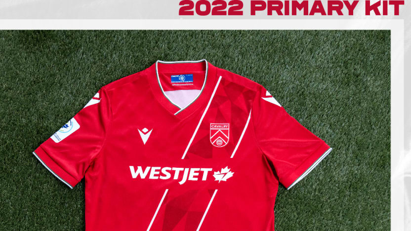
Cavalry FC’s primary is, as ever, red, and this year the club has brought back the regimental sash across the front that was incorporated in both their 2019 and 2020 kits, but absent from the 2021 design. The angular shapes on the sash pay tribute to the buildings that make up Calgary’s unique skyline. Similar to past Cavalry shirts, this year’s has small accents of both white and regimental green along the collar and sleeves.
Alternate
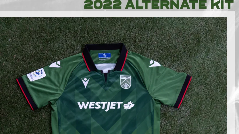
The Cavs’ classic green is the star of their 2022 alternate jersey this season. A primarily monochromatic jersey with black and red accents hosts a sublimated chevron on the jersey front. Like Cavalry FC’s crest, the chevron is an homage to the Alberta Foothills, the gateway to the Rocky Mountains. The emblem inspired by Lord Strathcona’s horse hits proudly on the back of the jersey.
 FC Edmonton
Primary
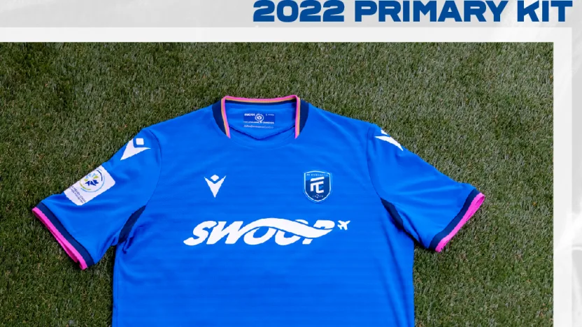
The Eddies’ primary shirt is, as ever, royal blue, but this year’s offering has hints of colour that pay tribute to the Alberta coat of arms, including the gold and green along the hem to represent the forests and wheat fields across the province. The collar and sleeves are adorned with wild rose pink in honour of the city of Edmonton’s official flower. The torso of this shirt features a faint jacquard striped pattern inspired by the blue Albertan skies.
Alternate
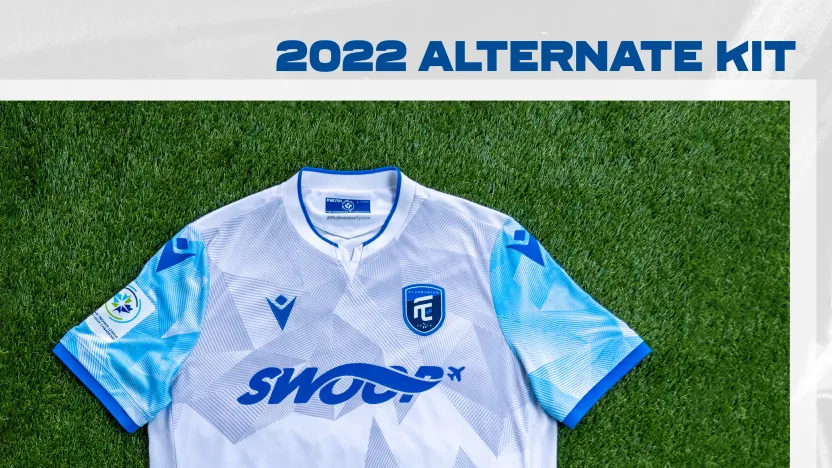
Inspired by one of Alberta’s most popular events, Ice Castles in Edmonton, the Eddies’ alternate 2022 kit reflects this frozen attraction, replicating the thousands of icicles and ice shards throughout the jersey. The sublimated print is enhanced with the colours of ice an shades of ice blue, grey and white. No season is complete without FC Edmonton’s ambassador and good luck charm, Rally Rabbit, proudly situated on the back of the jersey.
Third
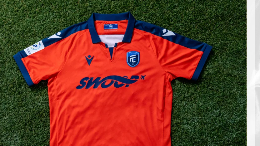
The Eddies will be paying their respects with a third kit this season — with an Edmonton Drillers throwback jersey. Although a different team, they were the first professional soccer team in Edmonton and still garner a lot of respect and nostalgia amongst the community. It ties back to the 80s, and the peak of the original NASL. Their away colour was orange partially due to the Dutch influence in the community and by their head coach at the time. FC Edmonton also has a history of Dutch coaches, and the Dutch form a large community in the city. A classic jersey in orange and navy, with the new era of soccer, FC Edmonton, named on the back of the jersey.
 Valour FC
Primary
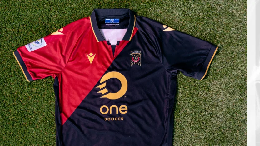
Valour have returned to basics somewhat with this year’s primary shirt, with two simple blocks of black and Valour maroon arranged diagonally, with accents of harvest gold. They’ve also got a new collar this year, perhaps similar to the collar they wore in the inaugural 2019 season.
Alternate
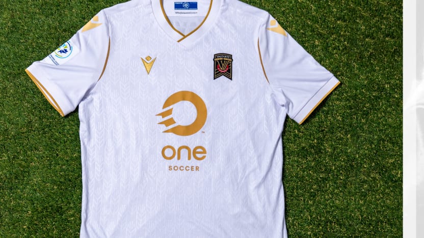
A nod to the snow-covered Manitoba prairies is the highlight of Valour’s 2022 alternate jersey. This all-white kit features harvest gold trim throughout with the team’s mainstay wheat print embossed on the front. This jersey is also a nod to the fans and supporters of Valour FC — the wheat print symbolizing new growth and hope after a long hard winter and difficult year everyone has experienced.
 Forge FC
Primary
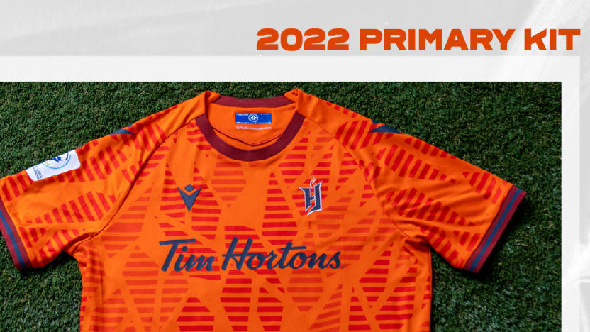
Forge have a slightly different take on their classic orange look this year. The tone-on-tone pattern across the kit is representative of sparks flying from a hammer, inspired by the energy of the city of Hamilton itself. This kit also features hints of grey and darker orange, including a spiked flame design at the hem. This year’s Forge kit will also feature their gold legacy patch on the right sleeve, which represents the two CPL championships the club has won.
Alternate
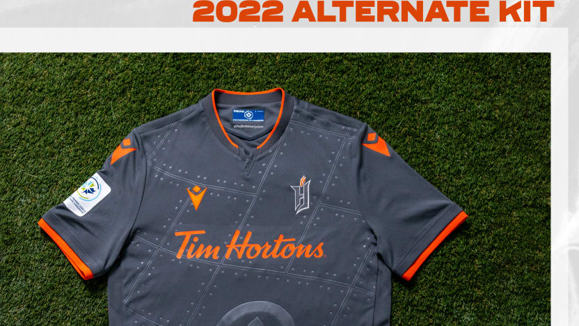
Paying homage to the Canadian Warplane Heritage Museum in Hamilton, Forge’s primarily sheet metal grey — with orange accents — alternate jersey is a nod to the museum’s love of aviation and its desire to maintain and preserve Canada’s aviation history. No jersey is complete without a nod to Forge’s beloved community and the city of Hamilton, so a cinquefoil, the heraldic flower in the city’s flag, is embossed on the front of the jersey with Hamilton proudly printed on the back.
 York United FC
Primary
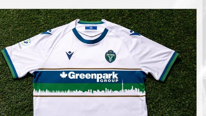
Just the second primary kit under the York United crest, this year’s white jersey features all of the club’s familiar colours in York green, Lake Ontario blue, and Victory gold, which all feature on the torso stripe as well as in places around the sleeves and collar. York’s new primary kit sponsor — Greenpark Group — is placed above a silhouette of both the forests to the north of York Region and the Toronto skyline to its south.
Alternate
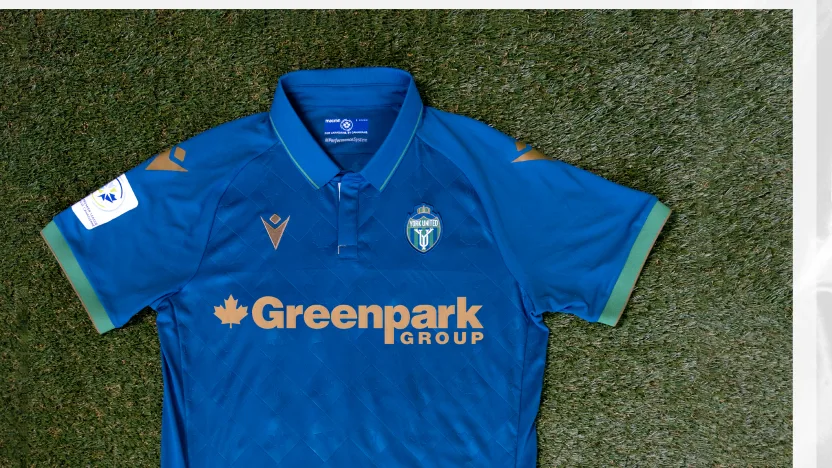
The alternate 2022 jersey features a unique diamond pattern embossed on the front and back of the jersey in Lake Ontario blue. This truly Canadian shirt — always connected to York’s home — features Canada’s maple leaf and Ontario’s flower, the trillium, repeated throughout the pattern. York Green and Victory Gold accents are highlighted throughout.
 Atlético Ottawa
Primary

The iconic red and white stripes of the Atlético Madrid family once again adorn Ottawa’s kit this year, with familiar hints of blue on the collar and sleeves. In honour of the city they call home, this year’s offering features a chevron design within the red stripes in tribute to the locks of the Rideau Canal. Returning once again in 2022 is the sublimated maple leaf on the back of the shirt, honouring the club playing in the nation’s capital.
Alternate
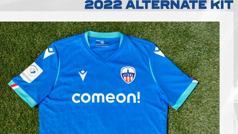
An exciting change to the red and white stripes that are iconic with Atlético for the 2022 alternate kit. Inspired by the City of Ottawa flag’s colours, the blue and teal jersey is symbolic of the rivers and waterways known in the Ottawa region. The teal represents the green spaces in the city — forests and parks. An artistic interpretation of the flag’s “O,” representing Ottawa, is proudly embossed on the front of the jersey. No jersey is complete without a nod to the club’s parent organization Atlético Madrid with a red and white stripe embellishment on the sleeves.
 HFX Wanderers FC
Primary
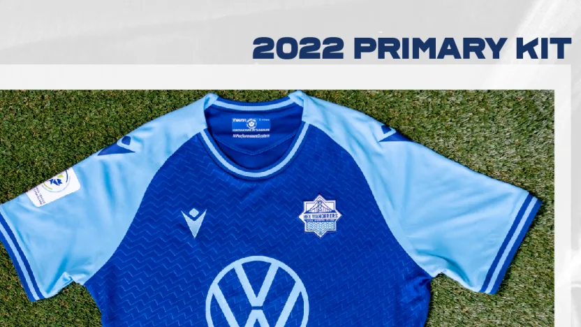
This year’s Wanderers kit is a little different to previous editions, though it’s still composed of the classic dark and light blue colours seen on each of their previous shirts. In this instance, the dark blue takes centre stage on the torso of the shirt, decorated by a faint wave pattern to match the design in the HFX Wanderers crest. The sleeves are light blue, with several other accents in that colour throughout the jersey.
Alternate
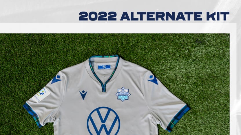
Halifax Wanderers bring attention to Nova Scotia’s distinctive history by showcasing the club’s naval grey as the base for the kit design. Accents on the trim of the shirt and the player’s numbers are inspired by the Nova Scotia tartan (the first provincial tartan in Canada). Colours found on that tartan adorn the jersey throughout to connect the team to their home.
